GRAPHIC DESIGN
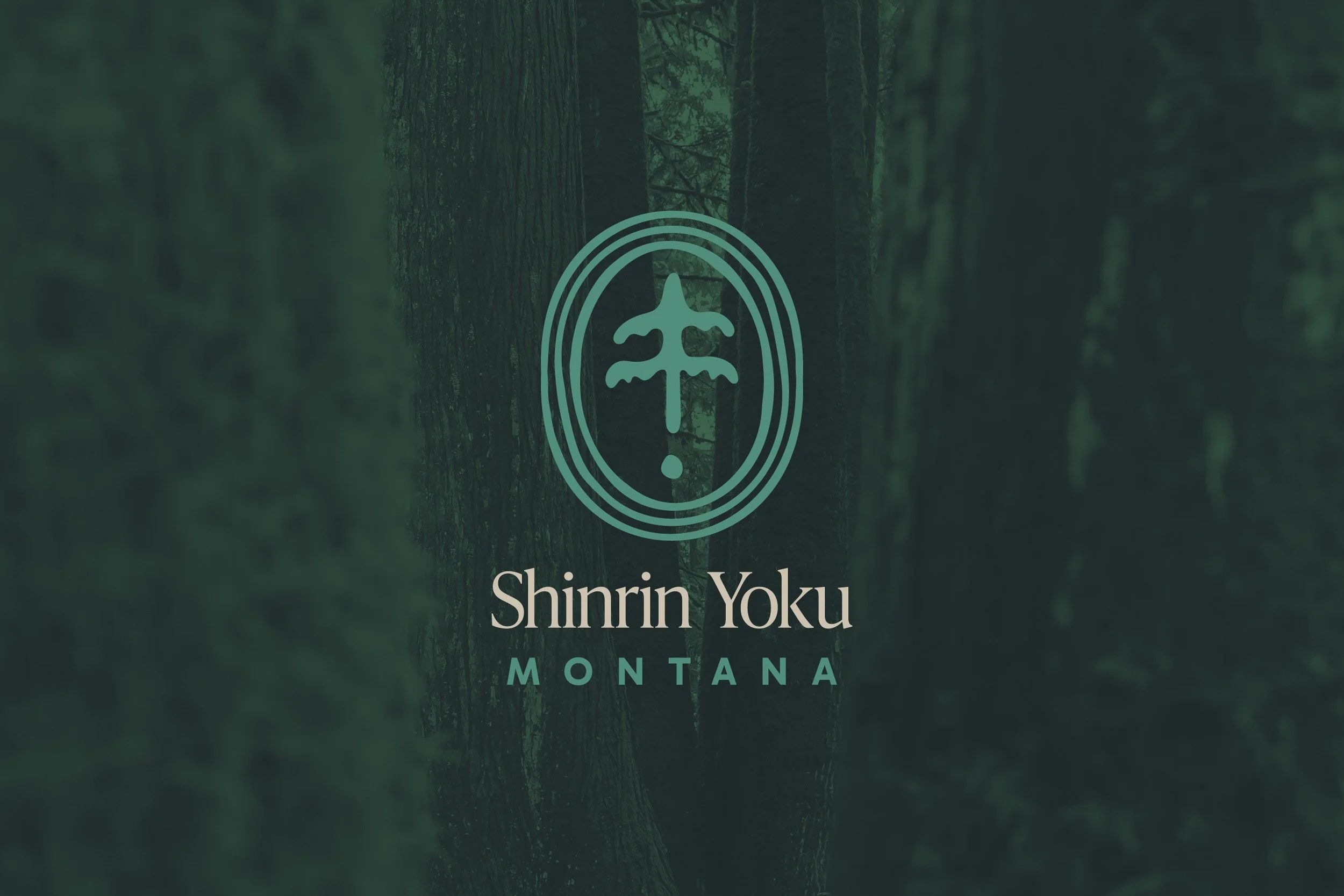
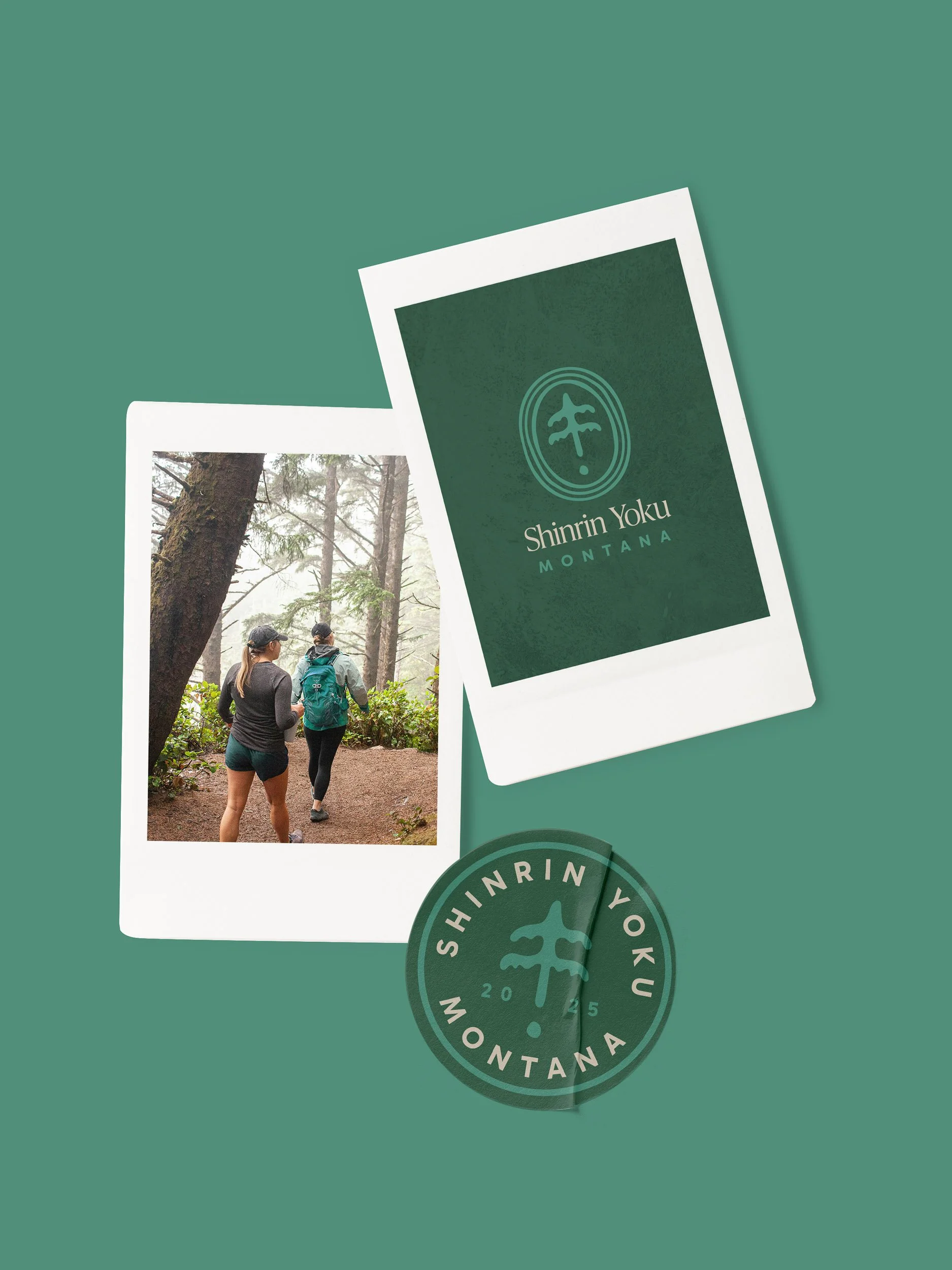
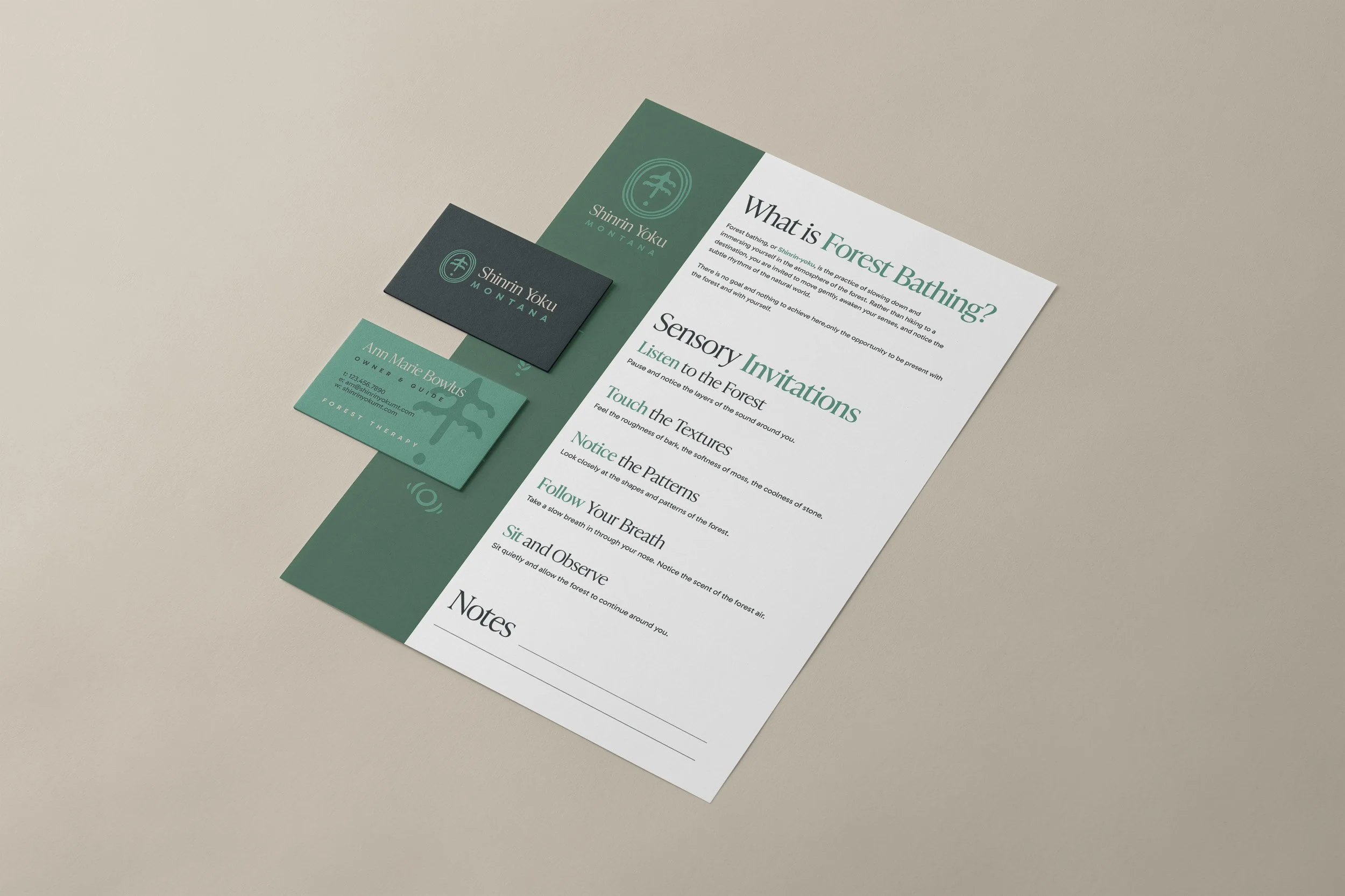
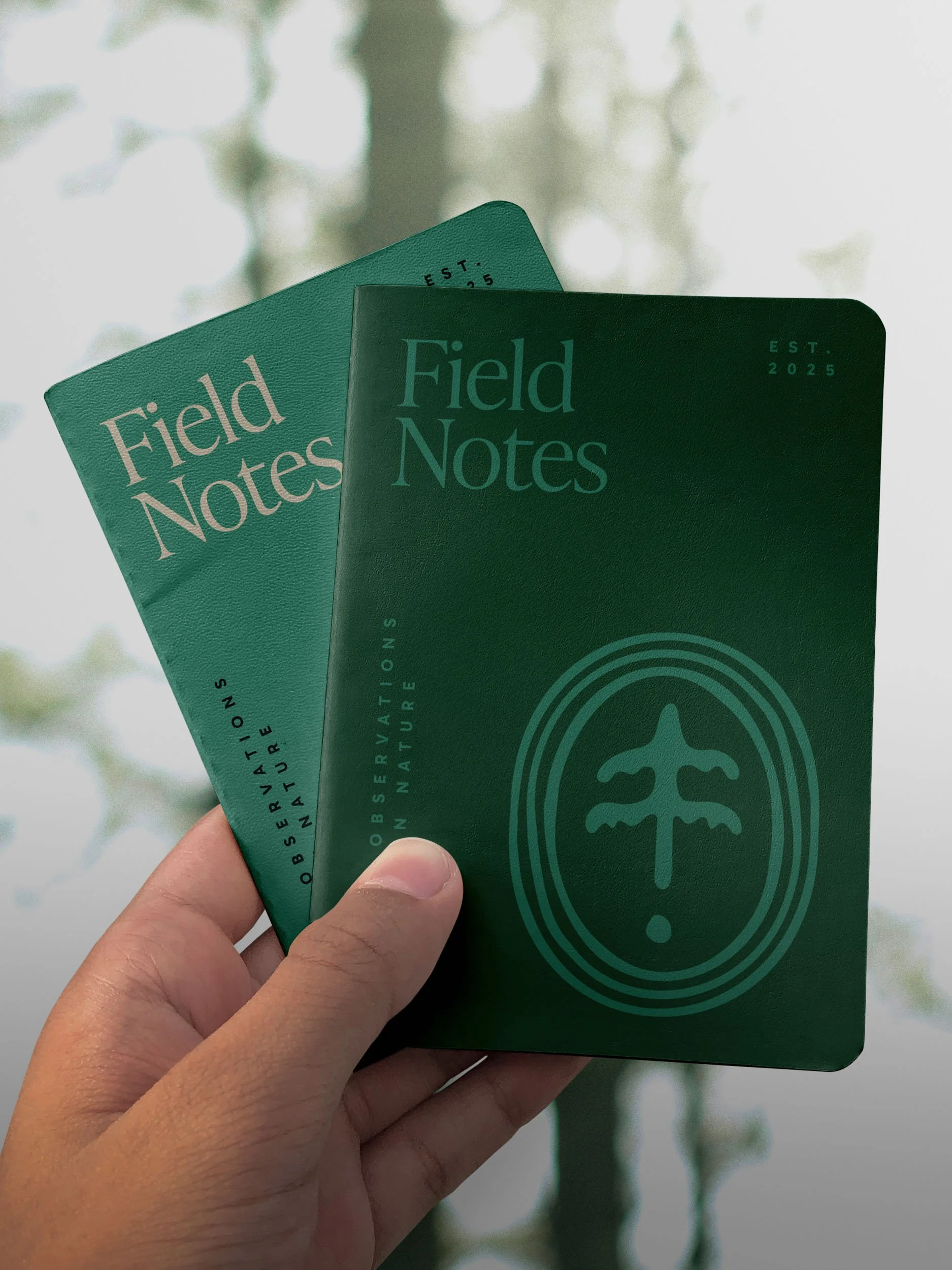
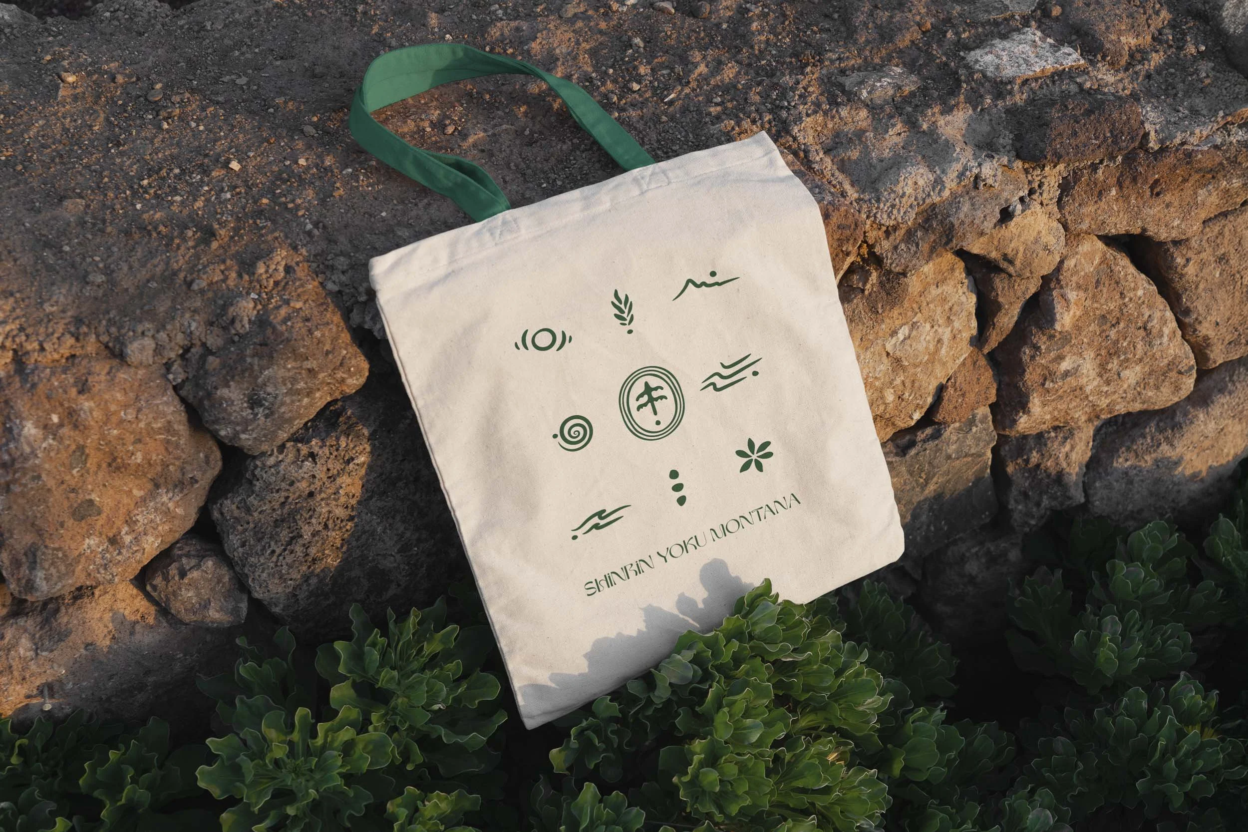
Shinrin Yoku Montana
A brand identity for a Montana forest therapy guide rooted in mindfulness and connection to the natural world.
PROJECT OVERVIEW
Brand Identity
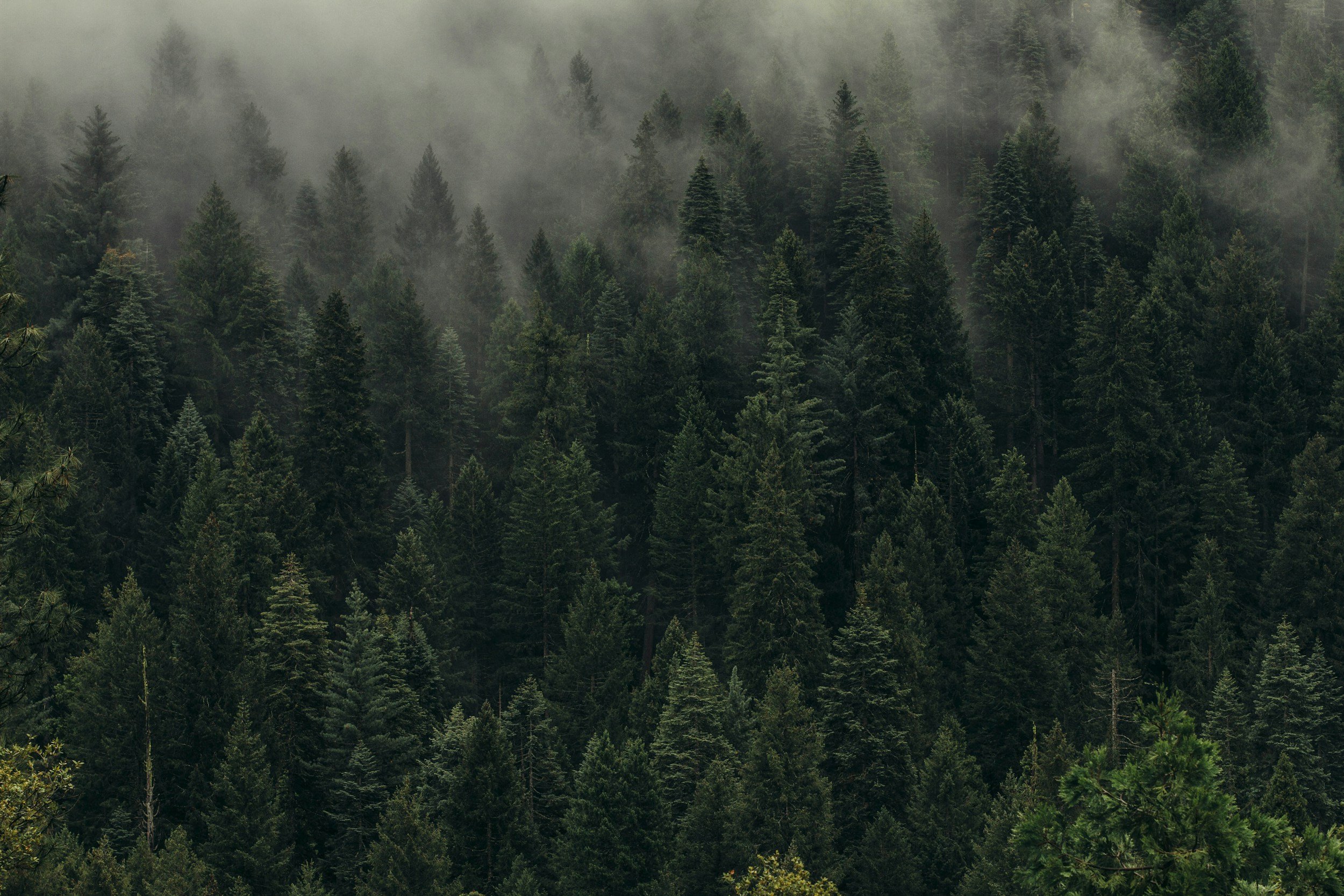
Shinrin Yoku Montana offers guided forest therapy experiences designed to help people reconnect with nature. The brand identity needed to reflect calmness, mindfulness, and the healing power of the natural world.
Inspired by the Japanese philosophy of Shinrin Yoku, meaning “forest bathing,” the visual identity uses soft typography and natural colors to evoke quiet reflection and connection with nature.
PROCESS
How It Works

Discovery
Understanding your brand, audience, and goals through deep discovery and conversation.
Concept
Exploring directions with mood boards, sketches, and initial concepts.

Refine
Iterating on the chosen direction until every detail is right.

Finalize
Final files, brand guidelines, and everything you need to launch your brand with confidence.